
Find out which carriers are actually damaging your freight
Everyone has an opinion about which carriers are careless. Almost nobody has the data, because the only damage that gets recorded is the damage somebody noticed and bothered to write up.

Your damage data is a biased sample
Recorded damage is not a measure of damage. It is a measure of damage that was noticed, on a shift where someone had time to document it, on freight where it seemed worth the trouble. That sample is skewed by attention, not by carrier behaviour.
Which means carrier scorecards built from claim history mostly measure how visible the damage was. A carrier delivering a steady stream of moderate damage that nobody photographs carefully can score better than one whose single severe incident got a full write-up.
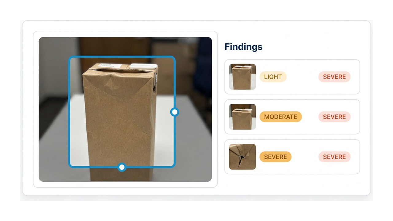
Grading every inbound photo at the same standard removes the attention variable. What is left is closer to an actual rate — and it is built from photos you were already taking, which means it costs no additional work at the dock.
What becomes possible
Rates you can compare
Consistent grading across every inbound shipment means carrier A and carrier B are being measured the same way, which is the minimum bar for the comparison to mean anything.
Evidence for the review
A carrier conversation backed by graded findings across a quarter is a different conversation from one backed by three incidents somebody remembered.
Lane and pattern detection
Damage concentrated in a lane, a season, or a freight type is usually a packaging or routing problem rather than a carrier problem. Worth knowing which one you have.
A caution about the numbers
A damage rate from this is a rate of findings on photographed freight, which is not the same as a true damage rate — if a site photographs some shipments more thoroughly than others, that bias survives.
It is a considerably better sample than claim history, and it is worth being clear about which one you are looking at before anyone builds a carrier penalty on top of it.
Questions about carrier data
How long before the data means anything?
Long enough to have volume per carrier, which depends entirely on your mix. A carrier you use daily becomes readable quickly; one you use monthly does not, and you should not pretend otherwise.
Can we get this out into our own reporting?
Yes — the output is structured and comes back over the API, so it can go into whatever you already use for carrier performance rather than living in another dashboard.
Start collecting the record
It only works if the grading is consistent from the start. Upload a photo to see the output, then talk to me about a pilot.